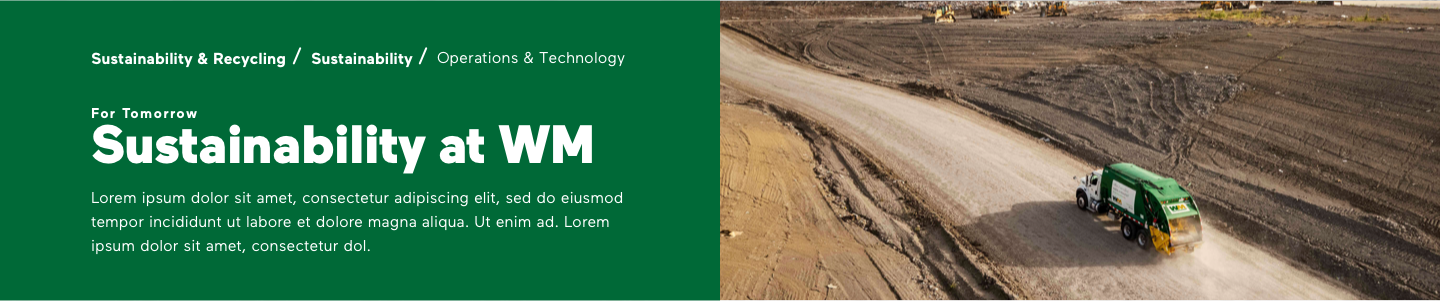
Design System Audit and Optimization for Scalability and Accessibility
Project Overview
While reviewing the work of temporary contract designers for quality control and brand alignment, I discovered that the inflexibility of WM’s existing components was forcing designers to detach them. This led to increased error rates and inconsistencies in the customer experience. This realization underscored the need for a comprehensive audit of WM’s customer-facing design system. Through this process, we addressed critical issues in accessibility, scalability, and flexibility, resulting in a cohesive, accessible design system, and ultimately, an improved customer experience.
My Role
Lead Product Designer, Design System
Client
WM (Waste Management)
Tools & Methods
Sketch, Jira Tickets, Microsoft Teams, FigJam
The Problem
Inflexible master components led to frequent detachment, resulting in higher error rates and an inconsistent customer experience.
The Solution
We made master components more flexible and prioritized accessibility, resulting in fewer errors and a more inclusive customer experience.
Project Strategy
Component Prioritization and System Audit
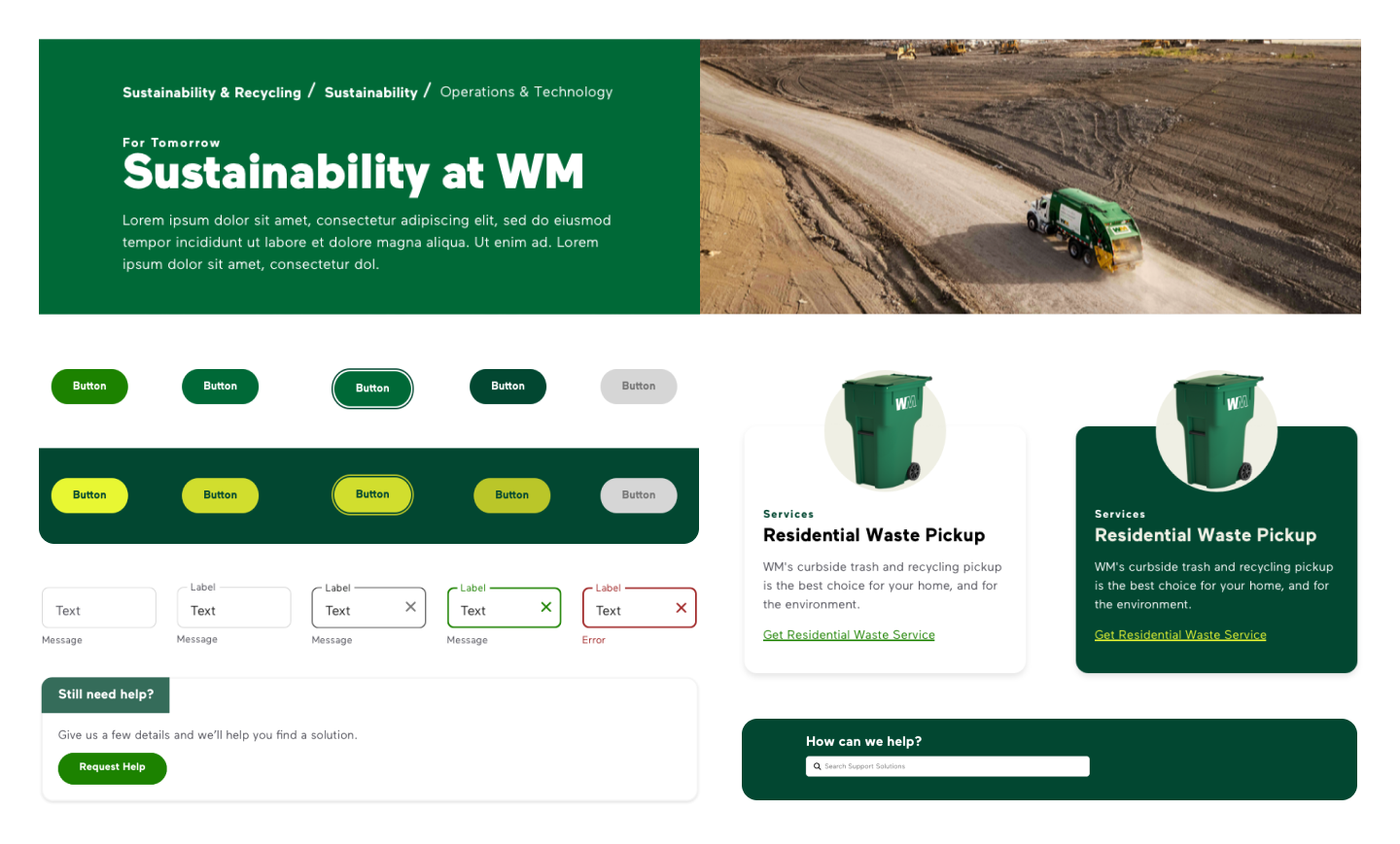
To make an immediate impact on the end customer experience, we prioritized components needed for upcoming designer deliverables. For the remaining components, we conducted a thorough review of the WM design system—built using Atomic Design methodology and organized into Foundation, Icons, Atoms, and Templates—starting with foundational elements and progressing to more complex components. This approach ensured a comprehensive audit, a seamless project hand-off, and alignment with business deadlines.
Auditing The Foundation Library
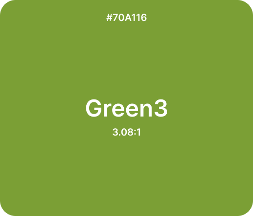
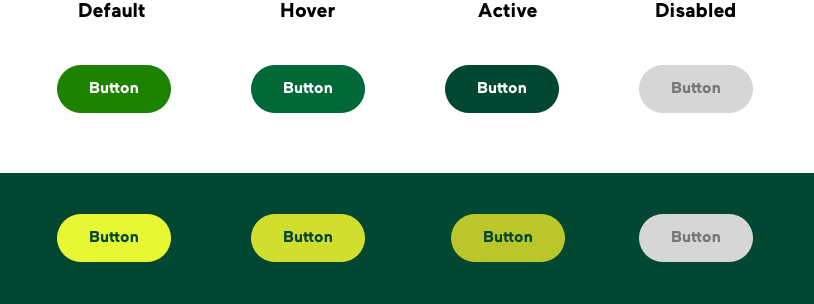
1. Inaccessible Color Combinations: Two pre-approved color combinations didn’t meet WCAG accessibility standards, so we replaced the lighter green with the WM branding green, which had been underused in digital interfaces compared to branding materials.
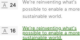
2. Inconsistent Text Styles: Six text styles had the same font size but inconsistent line heights, which we standardized.
Before

After

Before
After
Project Strategy
Optimizing Audit Process: Enhancing Collaboration and Design Consistency
Throughout the audit, we closely collaborated with the branding and engineering teams to gain stakeholder approval and ensure alignment. After implementation and regular development QA, we added a design QA phase to resolve any inconsistencies between design and code. Weekly check-ins were held to tackle challenges, review updates, and refine handoff procedures, while Jira helped us track and prioritize ongoing refinements.
Auditing The Icon Library
When reviewing the iconography, we identified two key issues: inconsistent stroke weights and styles, along with a lack of pixel-perfect execution in many icons. Additionally, the misalignment between digital icons and print illustrations highlighted the need for a cohesive redesign. In response, the company launched a complete icon library overhaul, led by a colleague, to ensure consistency, brand alignment, and adherence to modern design standards. She worked closely with the brand team, prioritizing and reviewing 10–20 icons per week based on upcoming deliverables.
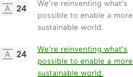
Enhancing Accessibility with Focus State Buttons
The design system lacked focus states for buttons, making navigation difficult for users who rely on keyboards or alternative input devices. By implementing focus states, we enhanced accessibility, ensuring a more seamless and inclusive user experience.
Before
After

Auditing Atom Library: Making Form Fields Flexible
Form fields often detached due to non-responsive height issues. Even when error messages were hidden, the static height broke the 8-pixel spacing system, forcing designers to detach from the master component. To resolve this, I introduced vertical alignment, making the component height responsive. I also ensured pixel-perfect precision and standardized spacing to the 8-pixel system. Additionally, I streamlined the master components, reducing them from six to four. This consolidation eliminated 10 instances, improving usability, consistency, and scalability while enhancing both design and development workflows.


Modernizing Card Components
During our audit, we explored ways to enhance the look and feel of our components, aiming for a more modern and approachable design. The card component was one of the first we refined to improve UI. By increasing the corner radius, adjusting the shadow, aligning with branding standards by avoiding all-uppercase titles, and refining margins for better spacing, we achieved a more contemporary look while maintaining WM’s branding and visual style guide. Additionally, we introduced a dark-background variation, approving it as a potential future option.
Before

After (Light)

After (Dark)